
 |
| Catwoman #0, cover by Guillem March. |
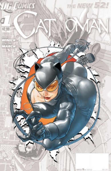
There's a lot to dislike, here, if you care even a bit about anatomy. (And since Catwoman's abilities do not involve the reshaping of her body to fit her whim, the "it's fantasy!" argument really doesn't hold water.) Her breast plate appears to be angled outward and upward(?!), which, given the position of her tailbone, would mean that her spine is bending at something like a 50 degree angle. And bending in the wrong place. And her abdomen is about 3 feet long. (Let's not even talk about how it's being simultaneously twisted, though.) I suppose that's theoretically do-able - gymnasts can certainly bend backward - but not under these circumstances. Catwoman's legs, arms, and neck are moving against the curve of her spine, whereas the gymnasts entire body needs to contributing to make it work. The movement of her jump doesn't make sense, either - she's leaping forward into space, but her body would have to be arcing backward for this to be even slightly plausible. And to make matters worse, if you were to map out the structure of her shoulders and collar bone, you'd need to conclude that her neck is actually popping out of left shoulder. (Well, either that or her head has been dislocated from her neck. Which is possible, because the angle of her face looks wrong, too.)
But perhaps surprisingly, the frothy-mouthed barking has not come from people who hate the cover. It's come, instead, from the people defending it.
Let me back up a bit, though. There have been critics of the cover, of course. But, y'see, one only has so much energy and disbelief to devote to these things when this is probably only one of a dozen gratuitous and impossible T&A comic book covers that will grace shelves this month. Which is why most of the responses - and this has been true of most comic art since Escher Girls was created, at least - have involved gently, and hilariously, mocking and parodying the image. And, in some cases, even correcting it. (Click those links. They're pretty great.)
But about the anger - this reaction, written by Jason Kerouac, to the re-draws and critiques appeared yesterday. And he's not at all happy that people are criticizing the cover. (He begins with "Grow the fuck up", so you know he means business.)
He suggests that the pose is plausible, but he's wrong and his photo comparisons aren't even close. He also suggests that it doesn't matter because it's art - money quote: "Y’know who else exaggerated anatomy? Picasso" - but ignores the fact that this artist is actually a realist, and some basic rules do apply. And he makes the classic recourse to reverse-sexism, arguing that men are exaggerated and sexualized, too. Except that they're not, really - idealized, yes, but there's no male equivalent to the fetishization of double-D breasts, peeking through rubber-catsuit cleavage. (Centuries of sexism and the resulting imbalance of representational power will do that.) So, he provides a lot of arguments, but they don't work so well together - he plays both the realism and surrealism cards, which is weird - and none of them work separately, either.
Part of the problem, I think, is that he doesn't seem to really understand why people dislike the cover. He thinks that the response has to do with anatomy, with Catwoman being a poor role-model, and with being a "cool kid" who can poke fun. And it might have something to do with each these. But what these reactions are really responding to misogyny - to a comics industry that still can't see why a female superhero or supervillain is worth reading unless her tits and ass are magically detaching from her body and flinging themselves at you - the 90% male readership of super-hero comics - while you read about them.
Did I say "them"? Sorry, I meant "read about her".
2 comments:
I've come across quite a few people defending this cover (I should probably read Reddit less...) with a rather odd amount of vitriol. Most of the defences rotated around the fact that the image is meant to be sexy, that "sex sells" and she's a super-flexible cat burglar so the pose totally makes sense. This seemed a little strange to me as most of the complaints about the image are not that it is too sexy but that in the attempt to fit as much cheesecake into the image as possible the artist made some awful anatomy errors. Yet the defenders of the cover kept going back to statements about Catwoman being "idealised" on the cover and that there was nothing wrong with cheesecake. I think some people are so afraid that sexy superhero characters are going to be taken away from them that they can't even admit when the "sexy" has become a detriment to the artists work.
It seems a shame that DC would go for a cover like this for Catwoman just when she's about to appear in The Dark Knight. They should be trying to bring in new fans by giving Brubaker's run a new set of trades or giving away a free Catwoman issue to those with tickets from the film or something. Could even be a good way to get more women to read comics as they will certainly be going to see the film! I think she's the sort of character that appeals to young women. (The first superhero comic book I ever bought was an issue of Catwoman when I was 14)
There's a difference between a real/plausible kind of sexy and this kind of inhuman/impossible sexy. The link that I attached to the artist who 'corrected' the pose illustrates it pretty nicely. (Even though it's still cheesecake.) And I don't know why all these people don't understand that.
And the point about the movie is a good one. They're totally squandering it.
Post a Comment